
Chat Widget Best Practices: Placement, Design and When to Show It

Over half of all web traffic now comes from phones: 51.5% in the second quarter of 2026, according to Statista. That’s where most chat widgets go wrong. The default bubble lands on top of your add-to-cart button, greets everyone with “Hi! How can we help?”, and pops up before visitors have read a line.
Your visitors notice. In Baymard Institute’s usability testing, most users saw live chat that opened on its own as “just another annoying, site-initiated distraction.”
The solution isn’t a new tool, but knowing where to place your widget, which pages should show it, how to design it, and when it should speak up.
Where to place your chat widget
Visitors have seen enough chat widgets to know where to look: the bottom-right corner. Putting yours there means nobody has to hunt for it. Move it to bottom-left only if something important already lives bottom-right, like a sticky cart button or an accessibility menu.
The corner is the easy part. The real problems come from what the widget sits on top of, and they show up mostly on phones, where a launcher that looks small on your laptop can cover a real chunk of the screen.
On desktop
- Leave some space from the edge. A launcher pressed right into the corner looks cramped and is easier to miss. A little padding from the bottom and side helps it look like part of the page.
- Keep it fixed as people scroll. A visitor halfway down a product page should be able to ask a question without scrolling back up.
- Make sure the open window doesn’t cover what they’re asking about. If someone opens a chat to ask about a product, they should still be able to see the product.
On mobile
- Keep the launcher thumb-sized, not bigger. Big enough to tap easily, small enough that it doesn’t block content.
- Open chat full screen. A half-height chat window on a phone leaves room for neither the conversation nor the page.
- Check every page with a sticky bar. Product pages, carts, and checkout often have fixed buttons along the bottom of the screen. That’s exactly where most launchers sit.
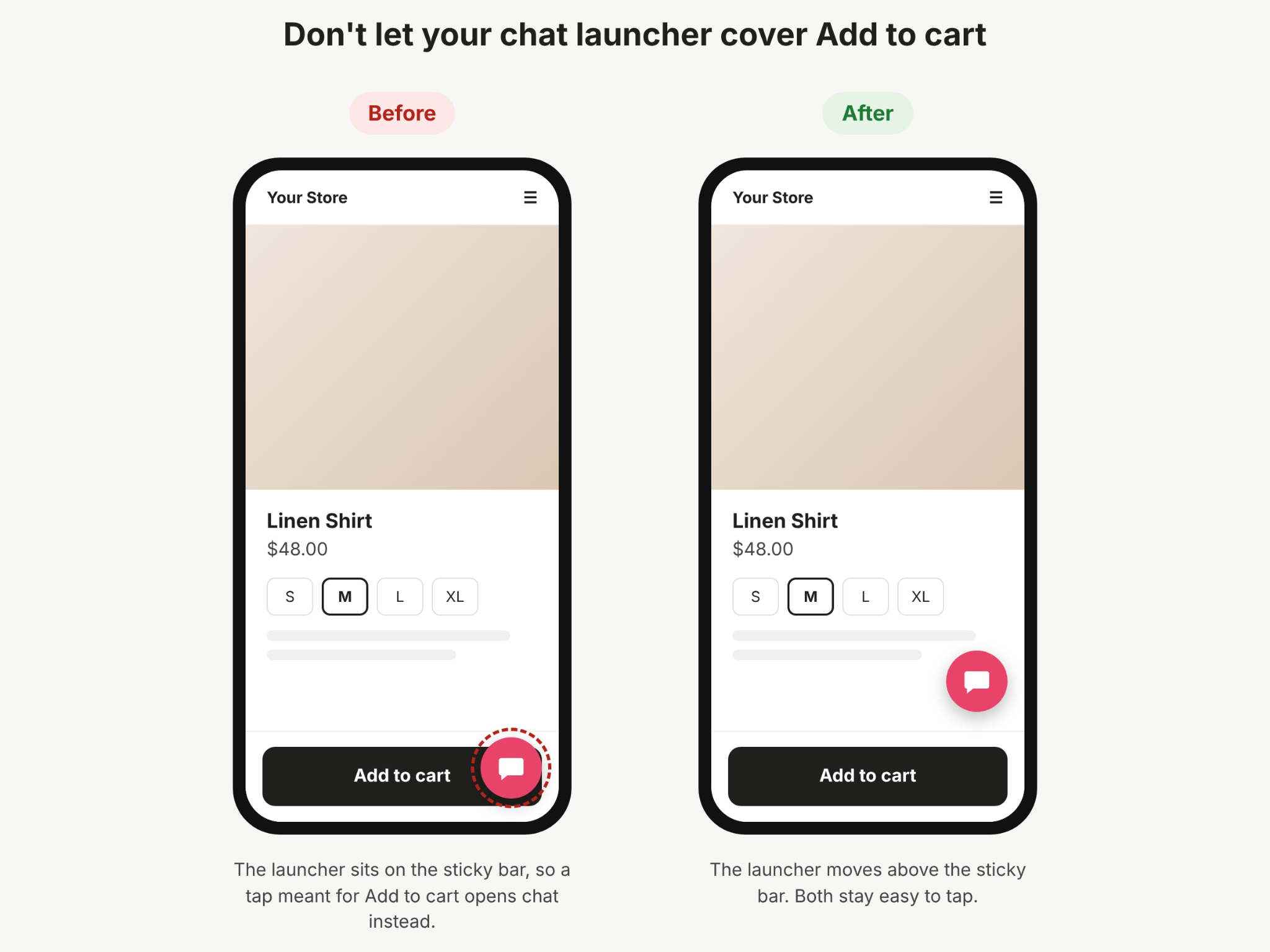
Don’t let your chat widget cover these
Before you go live, open your site on a phone and a laptop and check the widget never sits on top of:
- Add-to-cart, “Buy now”, or checkout buttons
- Sticky headers or bottom navigation bars
- Cookie or consent banners (visitors can’t close them, or open chat, if the two overlap)
- A WhatsApp button or second chat tool. If you use both, put them in one place or bring them into one widget. Our guide to WhatsApp chat widgets covers how.
- Back-to-top buttons, accessibility menus, or review badges
- Form fields, especially the submit button
Which pages should show your chat widget, and how
Once your widget sits in the right spot, the next question is how it should behave on each page. A visitor reading a blog post and a visitor stuck at checkout need very different things from it, and treating every page the same is the most common reason widgets annoy people or get ignored.
Pick a page type below to see how your widget should behave there, then adjust it to your own pages.
Two rules make this work. First, the more a page is about deciding, the more useful a proactive message is. Second, the closer a visitor is to paying, the less the widget should interrupt. For more lines to start from, see our live chat greeting examples, which are organized by page.
How to design your chat widget
Good widget design has two parts: the launcher button visitors see on every page, and the chat window they see once they click. Most guides stop at the button, but the window is where visitors decide whether to type.
The launcher
- Use a shape people recognize. A speech bubble works because visitors know what it does without reading anything.
- Add a short label where you have room. On desktop, “Chat with us” or “Questions? Ask us” next to the icon removes any doubt. On mobile, the icon on its own is usually enough.
- Make it stand out without shouting. Pick a color from your brand that contrasts with the page behind it. A constant bounce or pulse gets annoying fast. One gentle movement when a proactive message appears is enough.
Match it to your brand
The default blue bubble that comes with most tools tells visitors “this is a plugin,” not “this is us.” Use your brand colors, your font if the tool allows it, and your logo or a real team photo in the header. The chat should feel like part of your website, the same way your checkout does.
The words matter as much as the colors. A widget that greets people in a stiff, formal tone on a playful brand’s website feels off, so write greetings and replies in the voice the rest of your site uses.
The open chat window
When a visitor clicks, three things decide whether they start typing:
- Who’s answering. Show a name and photo for your team, or a clearly named AI assistant. Don’t present an AI as a person. Visitors usually work it out, and it costs you their trust.
- How fast they’ll hear back. “We usually reply in a few minutes” or “Our AI answers instantly, and our team is online until 6 p.m.” sets the right expectation.
- Where to start. One clear question, or two or three suggested buttons like “Track my order” or “Talk to sales,” works better than an empty box.
When nobody’s online
This is the part of widget design most businesses forget, and it’s often when visitors need it most. If no one is available, the widget should say so honestly and still be useful. That means one of two things:
- An AI that answers now and hands the conversation to your team in the morning if it needs a person.
- A short form that asks for an email address and tells the visitor when they’ll hear back.
What it shouldn’t do is look exactly like it does during working hours, then leave the visitor waiting with no reply.
When your chat widget should speak first
The page plan above shows which pages can open the chat on their own. This section covers when they should.
Respond to what visitors do
A good proactive message responds to something the visitor did, not to a timer that starts the moment they land. These are the signals worth acting on:
- Lingering on a pricing or product page without moving on
- Coming back for a second or third visit to the same product or plan
- Comparing, going back and forth between two plans or products
- Stalling in the cart without starting checkout
- Arriving from a campaign, when you already know what they’re interested in
Match the message to the signal. Someone comparing plans should hear “Want help choosing between Pro and Business?”, not a generic hello.
Once per visit is enough
If a visitor closes your message, take the hint. Don’t show another one on the next page, and don’t make the launcher bounce for attention. Showing nothing is better than a message that pops up in their first few seconds.
There’s no perfect delay for every site. Start on your busiest decision page, check whether the chats it starts are useful, and then roll it out further.
Make your chat widget accessible and fast
A well-timed message is wasted if some visitors can’t use the widget, or if it slows the page down. Two quick checks fix both.
Accessibility
Some visitors navigate with a keyboard, use a screen reader, or need high contrast to see what’s on the page. A quick test covers most of it:
- Tab to it. Press Tab on your site until you reach the launcher. You should be able to get there, open the chat with Enter, and close it with Escape.
- Listen to it. Turn on your phone or computer’s screen reader. The launcher should be read out as something like “Open chat,” not “button” or nothing at all.
- Check the contrast. The launcher, text, and buttons inside the chat should be easy to read against their background, including for people with low vision.
- Respect reduced motion. If a visitor has asked their device to reduce animation, the widget shouldn’t bounce or slide around.
Most chat tools handle some of this for you, so this is mainly about checking nothing is broken after you’ve customized colors and text.
Page speed
Every chat widget adds code to your pages. That’s fine as long as it loads after the rest of your page, so visitors see your content first and the widget appears a moment later. Most tools do this by default.
To be sure, test a key page with PageSpeed Insights before and after you add the widget. If the score drops noticeably, check you’ve installed it the way your chat tool recommends, and that you haven’t left an old widget’s code behind from a tool you no longer use.
Common chat widget mistakes
An old widget’s code left behind is one of many small mistakes that build up when a widget gets set up once and never revisited. Here are the most common ones, what visitors see, and how to fix each in a few minutes.
How to tell if your chat widget is working
The number of chats on its own doesn’t tell you much. A widget that pops up on every page will start plenty of chats, and most of them won’t go anywhere. Look at these instead, broken down by page:
- Chat rate: the share of visitors on a page who start a chat. A very low rate on a pricing page suggests the widget isn’t visible enough or the greeting isn’t relevant. A very high rate on a help page can mean the page itself isn’t answering the question.
- What people ask: read a sample of chats each month. Repeated questions show you what’s missing from that page, and what your greeting should mention.
- Response time: how long visitors wait for the first reply, especially outside working hours. Our guide to reducing response time covers how to bring it down.
- Outcomes: whether chats lead to what the page is for, like a purchase, a booking, or a demo request. This is the number that tells you whether the widget is earning its place.
- Dismissals: how often visitors close a proactive message without replying. If it’s most of them, the timing or the message is off.
Change one thing at a time, such as the greeting on your pricing page or the delay on your product pages, and give it a few weeks before you judge it.
Setting up your chat widget in Heyy
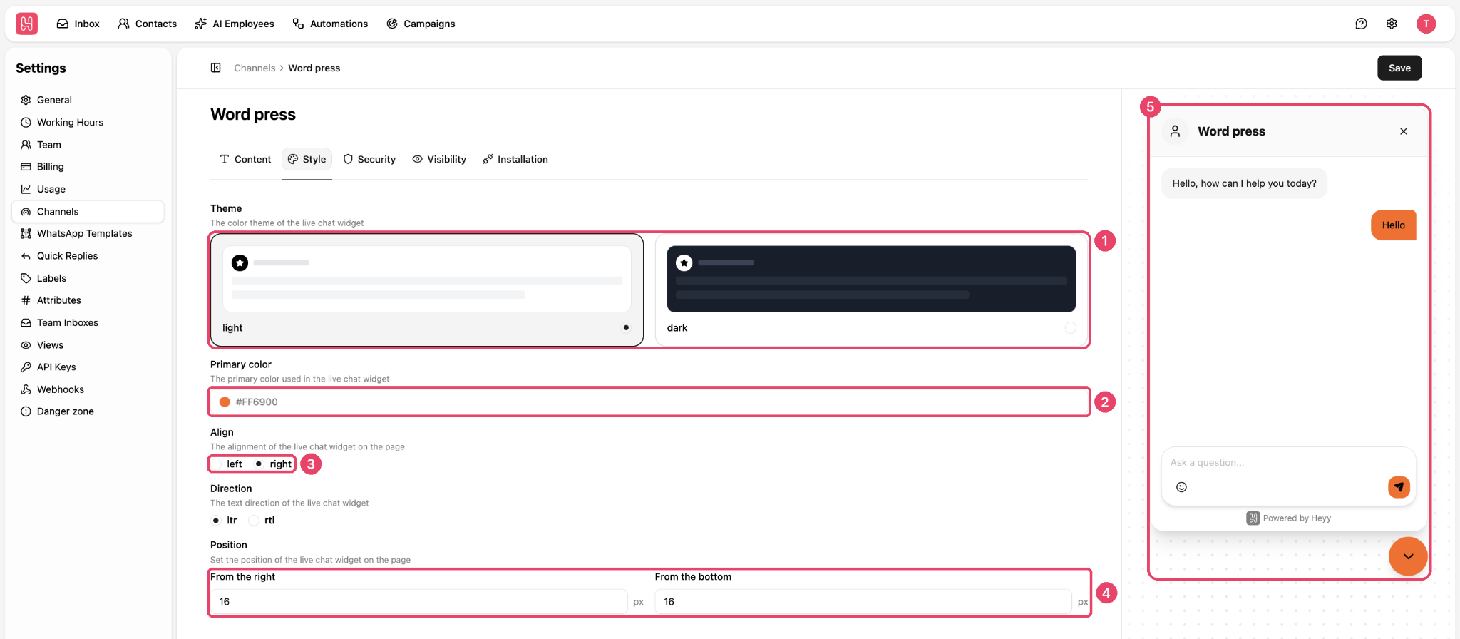
Heyy’s website live chat works on WordPress, Webflow, Framer, Wix, and Squarespace. You’ll find it under Settings → Channels, and a live preview shows every change as you make it. Here’s how the practices in this guide map to its settings:
Our guide to adding live chat to WordPress walks through the install step by step.
The widget is half the job. The other half is making sure someone answers. Your AI Employee replies to website visitors straight away, at any hour, in your brand’s voice. When a visitor needs a person, it hands the chat to your team with the whole conversation in front of them. Website chats land in the same inbox as WhatsApp, Instagram, and Messenger, so you don’t need a separate widget for each channel.
Before going live, test your AI Employee’s replies in the Playground, so you know what visitors will see.
Chat widget best practices FAQs
1. Where is the best place to put a chat widget?
The bottom-right corner, because that’s where visitors expect to find it. Use bottom-left only if something important already sits bottom-right. Wherever it goes, check it doesn’t cover buttons, banners, or forms, especially on mobile.
2. Should a chat widget open automatically?
Not as soon as someone arrives. Open it proactively only on pages where people make decisions, like pricing or product pages, and only after they’ve shown interest, such as lingering on the page or coming back for a second visit.
3. Should I show the chat widget on every page?
You can show the launcher on most pages, but the widget’s behavior should change by page. Let it speak up on pricing, product, and contact pages, stay quiet on blog posts, and stay out of the way at checkout.
4. Should the chat widget appear on mobile?
Yes, since many visitors browse on their phones. Keep the launcher small, open chat full screen, and check it never covers a sticky add-to-cart bar or a cookie banner.
5. What should a chat widget say first?
Something specific to the page that’s easy to answer. “Not sure which plan fits? Tell me how many people will use it” gets more replies than “Hi! How can we help?” Our live chat greeting examples have 40 to adapt.
6. What should happen when nobody is online?
The widget should still be useful. Either an AI answers straight away and passes the chat to your team if needed, or a short form collects an email address and tells the visitor when to expect a reply.
7. Does a chat widget slow down a website?
It adds some code, but a well-built widget loads after the rest of your page, so visitors don’t notice. Test a key page with PageSpeed Insights before and after adding it to be sure.
Make your chat widget earn its place
The best chat widgets sit where visitors expect them, look like part of your site, and speak up only when someone needs a hand. That takes an afternoon to set up and a quick check each month.
The hard part is making sure every visitor gets a fast answer, whether your team is busy, offline, or answering the same question for the tenth time today. With Heyy, an AI Employee replies straight away and hands the chat to your team when a person is needed. Try Heyy free for 7 days and see how many more conversations turn into customers.
More blog posts to read

Ready to Automate Support
Across Every Channel?

